

Contents
Mathematical view sees beyond conventional election coverage
By Steven Schultz
Princeton NJ -- Most of the time, biologist Sam Wang studies synapses in the brain, but that is not why Fox News recently summoned him to its New York studios. And U.S. News & World Report did not feature mathematician Robert Vanderbei because of his regular work in engineering and astronomy.
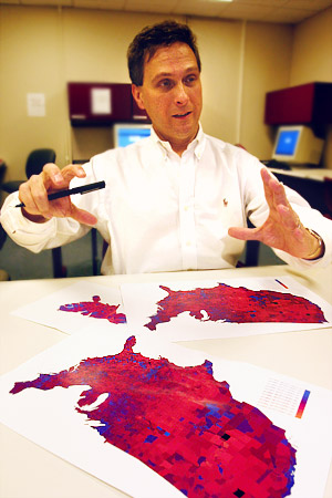
Mathematician Robert Vanderbei devised a computer program that colors a map with 256 shades from blue to red by county, instead of the traditional stark color breakdown by Democratic or Republican states.
Both faculty members attracted the attention of major news organizations in the last few weeks because they ventured beyond their normal work to show how mathematics can illuminate the often confusing numbers tossed about during an election.
Frustrated with the media's coverage of polling results, Wang created his own statistical procedure for distilling hundreds of state polls into a snapshot of which presidential candidate was leading the race for Electoral College votes. Within weeks of posting his calculation to the Web and beginning daily updates, election junkies on both sides were regular readers. A week before the election, his work was featured on the front page of The Wall Street Journal and a live Fox News interview.
''A lot of the campaign coverage this season was horserace stories about who was ahead in one state or another,'' said Wang, an assistant professor of molecular biology. ''In the week before the election, there were 17 polls in Florida. I wanted something that was more useful and less confusing.''
His solution offered readers a single set of numbers: How many electoral votes was each candidate most likely to win. First he averaged every available poll for each state and calculated the candidates' likelihood of winning that state. Then he wrote a program that looked at every possible combination of red (Republican) and blue (Democratic) for nearly 20 swing states -- millions of possible outcomes -- and calculated the probability of each scenario. This number-crunching revealed a range of most-likely outcomes, and the middle of this range became Wang's bottom-line assessment.
Right before the election, for example, the simulation showed that Kerry was 95 percent sure to win between 217 and 295 electoral votes, with the median being 252 -- exactly what he won. By looking at all polls at once, Wang said his system filtered out ''statistical noise'' and averaged out differences in polling techniques. His ''median outcome'' moved up and down over the months in response to campaign events, but was more stable than the national surveys.
Creating a 'Purple America'
Vanderbei, a professor of operations research and financial engineering, became interested in how people talked about the results of the election. After the 2000 contest, he was uncomfortable with the stark breakdown between red and blue states often shown on maps, because voters in most states were fairly evenly split.
''It really should be shades of blue and red and purple,'' Vanderbei said. As an exercise for a programming course he taught, he devised a program that would color a map of the 48 contiguous states with 256 shades from blue to red according to county-by-county vote tallies. He called the resulting map, with its fine texture and shifting hues, ''Purple America.''
''It makes the point that most people live in rather purple counties,'' Vanderbei said. ''I live in Somerset County, which went 52 percent for Bush, 48 percent for Kerry. I could go out to the grocery store and interview people and about half would say they voted for Bush and the other half for Kerry. We are not this divided nation that the media presents us to be.''
For most of the last four years, Vanderbei's map sat unnoticed on his Web site. Then a political scientist mentioned it in a paper and the Princeton Alumni Weekly gave it brief coverage in October, which prompted U.S. News & World Report to reprint the map just before this year's election. That coverage caused the number of visitors to Vanderbei's Web site to soar.
After the 2004 election, Vanderbei compiled the new data and posted the map that Thursday morning. By the afternoon, e-mail began rolling in from people who saw it, and a week later the number of e-mails reached hundreds per day.
Vanderbei noted that the map, while an improvement over plain red and blue varieties, still has a flaw: Very large and sparsely populated counties in the West give the map a disproportionately red hue, while densely populated democratic urban counties, which are often blue, appear very small. Physicists at the University of Michigan have tackled that problem by displaying Vanderbei's results in a ''cartogram,'' a map that is distorted according to population density, so urban counties are fattened and rural ones are squeezed.
Vanderbei said he enjoys the many comments and suggestions he receives, but also is looking forward to the attention dying down so he can return to his full-time research, which lately has focused on using mathematical techniques to optimize the design of a telescope that could find Earth-like planets around other stars. When 2008 rolls around, however, Vanderbei expects to produce a new map with the hope that the media also will more frequently portray the country as ''Purple America.''
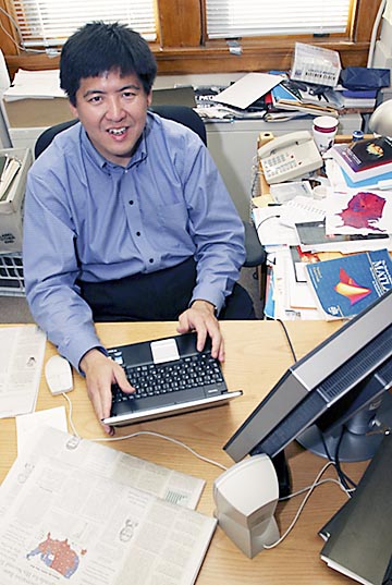
Biologist Sam Wang used his expertise in statistics to condense hundreds of polls into a single set of numbers predicting how many electoral votes each candidate was likely to win.
Drowning in polls
Wang also has happily returned to full-time neuroscience after becoming immersed in poll analysis in the weeks before the election. But, like Vanderbei, he hopes his work will live on and influence the mainstream coverage of elections and polls.
''The release of all these hundreds of polls -- essentially raw, unfiltered data -- drown out discussions of policy and anything more substantive that voters might care about,'' Wang said. ''If people used this sort of analysis as their way of interpreting polling information, then it reduces all the polling stories you see in the newspaper to a single story, a story not unlike the weather page.''
Another hope, he said, is that his application of statistics to a popular subject might spur interest in mathematics and science. ''Thinking about data in terms of probabilities and statistics is very much part of how I handle data in my lab every day,'' Wang said. ''I have to take lots of observations and boil them down into relatively simple measures of whether a phenomenon exists or not.''
After the election, a second Wall Street Journal article noted the accuracy of Wang's core assessment and declared in the lead sentence that ''Sam Wang and his computer look pretty smart.'' But Wang noted that he also was wrong because, on his Web site, he had gone beyond his original analysis and predicted how undecided voters would split and how get-out-the-vote efforts would affect results. His prediction was that these factors would push Kerry to a victory of 311 electoral votes.
Even without picking the winner, Wang said his Web site helped show activists on both sides where it would be most effective to direct money and volunteer work. For example, finding one more vote for your candidate in Ohio was worth more than 5,000 ''Jersey votes,'' in terms of its likely effect on the outcome, Wang said.
He's not ruling out another statistical analysis in four years -- but he's hoping that some news organization interested in telling a more accurate story will take his methodology and run with it.
Although he is no longer posting regular updates, Sam Wang's polling analysis Web site is available at: <election.princeton.edu>. Robert Vanderbei's ''Purple America'' map is posted to his Web site, <www.princeton.edu/~rvdb/JAVA/election2004>, where he also has links to the work of others who have built on his idea.
top